
Jan Dickey
Jan Dickey is an artist and curator based in Brooklyn, New York. Jan received an MFA from the University of Hawaiʻi at Mānoa in 2017 and a BFA from the University of Delaware in 2009.
He has exhibited his artwork throughout the United States and internationally in Tokyo, Japan. In 2016 Jan co-founded GRRIC Contemporary, an experimental gallery and performance space that continues to operate out of the University of Hawaiʻi at Mānoa. In 2020 he curated exhibitions at the Honolulu Museum of Art (Why Are You Painting?) and studioninedee in Chelsea, NY (Another Year in the Republic).
His medium of choice is paint, specifically earth-based binders like casein (milk paint), egg tempera, walnut oil, and rabbit-skin glue. In the studio, Jan explores paint as a living substance—creating artworks that peel, crack, and otherwise change over time. In 2021 his work was featured in the International Painting Annual 9 published by Manifest Press (Cincinnati, OH).
IG: @jan.dickey
Photo Credit: Kenyatta Kelechi
FRC9 or:
How I Learned to Stop Worrying and Love Shapes and Forms
06/20/2021
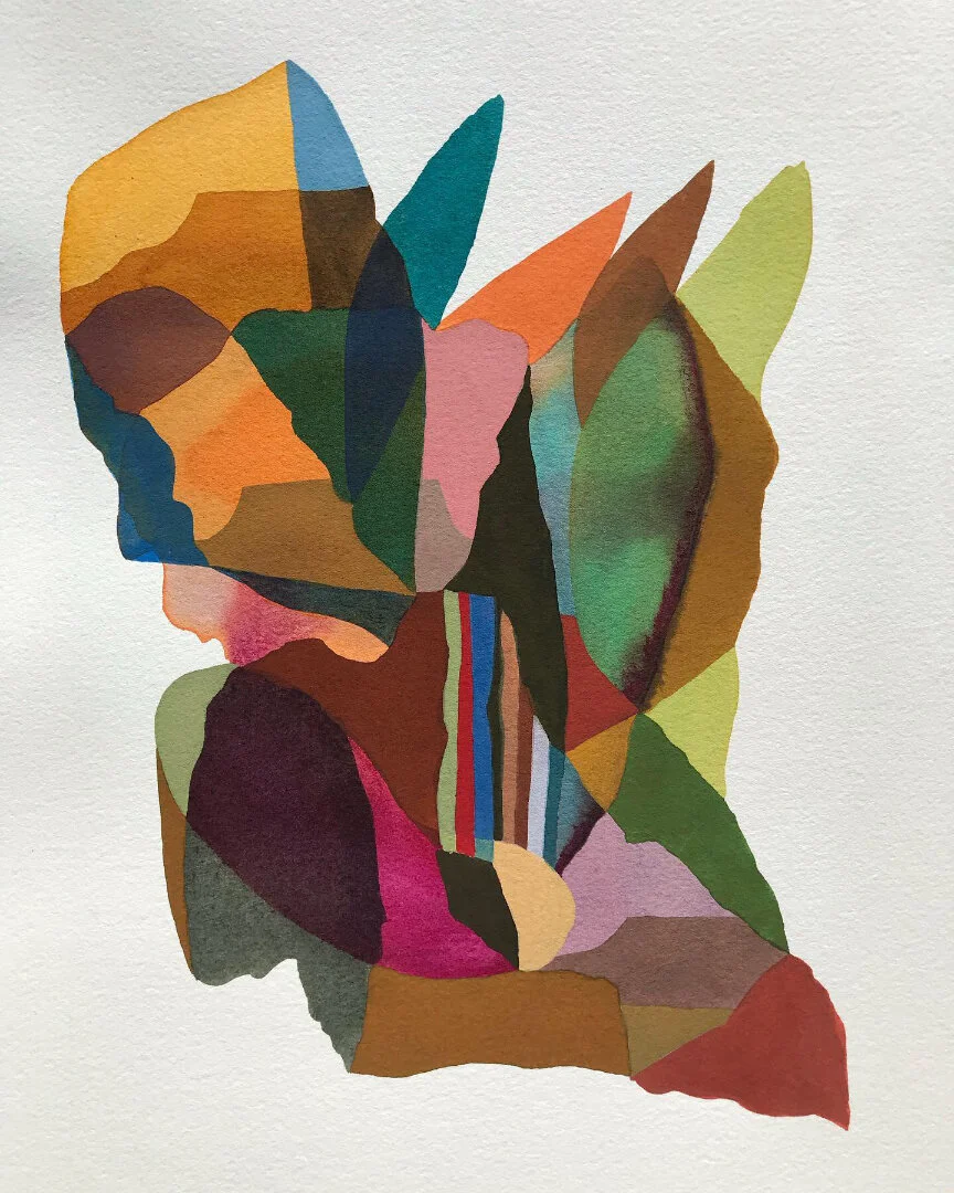
Shapes and Forms. That is the matter of fact title for each of Adithyaa Sadashiv’s meticulously painted 10” x 10” geometric watercolors included in the ninth exhibition hosted by online platform Flat Rate Contemporary. The titles of Sadashiv’s four artworks in FRC9 are not distinguished by roman numerals, arabic numerals, or symbols of any other kind; they are simply Shapes and Forms. In this way, the artist leaves us fumbling with our own communication tactics as we attempt to categorize the works: “I’m talking about the all red one,” or “I like the blue one with the black circle in the middle,” or “I am partial to the grayish one that has triangle, then a circle, all in a bigger triangle.” Sadashiv’s decision to allow the visual to speak for itself (in its own non-literate terms) is exemplary of a larger theme at work in FRC9.


Experiencing this collection of two-dimensional (flat) artworks through the minimalist, hands-off curatorial style of Flat Rate Contemporary, we are confronted with an online flat file exhibition free of artist statements, artist bios, and any direct links to further information on the artists. Arriving at the homepage, we are met simply by twelve images floating in a staggered 3 x 4 grid atop a blank white web page. What we have to go on as we begin to apprehend this webpage as an art exhibition is twofold: 1. the preconceptions in our own mind, which affect the way we each regard art and artmaking and; 2. a grid of images speaking twelve different languages through their shapes and forms. Flat Rate’s abstinence from the usual art world didactics allows us to interpret the works using a mixture of our own personal language (naming through categories) and formal observations.


For want of contrast against Sadashiv’s tightly controlled shapes and forms one is immediately drawn to Irina Alimanestianu’s nearby ink and marker works on paper. Edges of flowers and thermometers are ruptured to such a degree that their identities are nearly obliterated into the categories of stains, spills, and amoebas. These are shapes and forms exploding from the inside––their pigments bleeding into the artist’s chosen substrates. Our eyes then move to Cindy Jian, who crosses over completely into amoebic classification as her flows of resin, acrylic, and glitter erupt and pour over and into one another. Jian’s shapes and forms appear as something from under the microscope (or oppositely a very powerful telescope), but her unexpected color choices give us few guesses as to what could be through the looking glass––other than an alien bacteria or contamination from a chemical plant.


Moving from Jian to the work of Nellie Johnson one feels that the world is being slowly pulled back together, as we come to recognize domestic spaces populated with flowers and cats. Although the edges of Johnson’s forms are not fully coalesced, natural colorants seem to be gradually washing away the final traces of a chemical hue. Nature is healing.


In this fleeting moment of respite, however, our eyes are called to scroll down by the work of Antonio Pastoriza, whose unhinged use of fluorescent paint and frantic paper collaging––with titles like Desirable times in which we live––reminds us that humankind is on the verge of self destruction.


Phil Irish’s nearby painting of an iceberg is partly responsible for turning the mind toward climate apocalypse. Irish’s singular contribution to this exhibition hovers in the white void of the webpage like a bad omen of hard times to come after the foretold Hot Vax Summer. Red and black shapes shapes slice apart the artist’s own representation of this majestic ice form. It doesn’t matter where you are on planet Earth, when you see the colors red and black slithering toward you something bad is about to happen.

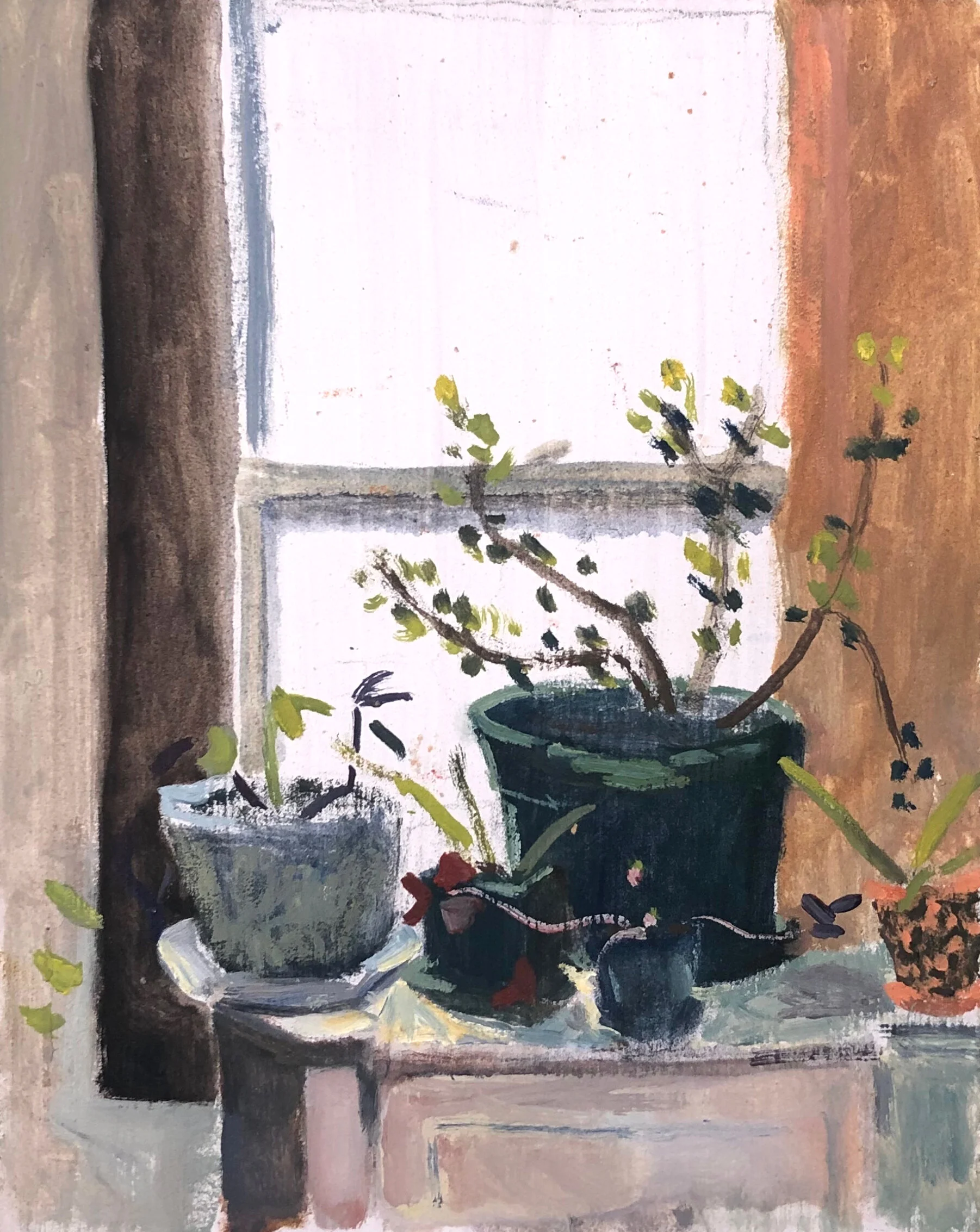
When we’ve had enough doom, why not some quiet, beautiful, and utterly longing gloom? There for us are a few familiar scenes from domestic life painted in oil by Peter Gehrig. Gehrig presents us with a painterly study of the shapes and forms of house plants near a window, longing impressions of spring flowers outside a window, and a gloomy yet beautiful look at someone else's window (likely painted from his window). These works, made between the years 2016 and 2019, sullenly mark the time elapsed during an uncanny one-term American presidency.


There is something in the photo collage work of Kelly Clare that feels like an analogous color to Gehrig. It is partially the actual colors; Clare’s palette is similarly desaturated, but Clare’s work also shares a similar feeling of claustrophobia within domestic life. Clare has us mixed up and jammed together with indoor objects in dim, artificially lit spaces. In the disorientation of Clare’s photo slicing and collaging the identities of such indoor objects become lost, and a familiar shelter-in-place malaise sets in. The familiar becomes decreasingly recognizable as we become increasingly tangled in our own mess.


For reprieve, our eyes slide further down to the airy collages of Molly McCracken who delivers us nonrepresentational shapes made with soft, familiar colors. These shapes join together into patterns and ultimately amalgamate into round, comforting forms. Looking at McCracken’s work is equivalent to gliding one’s fingers over a thrift store clothing rack, feeling a warm fluttering nostalgia as you rolodex the fabrics. There are instances of text and musical notation in the artist’s work, but these are fragmented to the point that what they signify carries no more meaning than a passing cloud.


Bethany Johnson’s 2-D take on rock carving is similarly disarming and indeterminate. We see close up (found) photographs of grey rocks with tightly controlled lines carved into the actual photos to create tidy white rows and zig-zags. They are relaxing, making use of the classic contrast between organic forms and geometric shapes and having the intended effect. The vibrating grid that emerges from the intersection of human-made lines and rock crevices interestly evokes both Op art and Anges Martin.


That quinsential interplay between the organic and the geometric does good work for the kaleidoscopic ink washes of Aaron Troyer as well. With dreamy names like Pinwheel Palisades and Tambourine Dream there’s a lot to enjoy here in 2021 Summer of Love. Make your way to the nearest dispensary or text that number on your phone to fully delight in Troyer’s shapes and forms. Troyer’s work feels like it was made under the shade of a tree next to a rock quarry on a warm afternoon.


We end on Tessa Krieg who boasts the most humorous shapes and forms in FRC9. Oddly enough, there is a loss of words that comes from looking at the artist’s colored pencil drawing In my bed, which cryptically dresses up the text “DRAGON IN MY BED” as the logo for 20th Century Fox and presents us with a steamy sex scene. Speechless delight compounds with Stacked––an oil painting that can only be depicting a sex doll manufactered by LEGO. And of course there is Krieg’s Untitled drawing of the back of someone’s head, their hair shaved to the skin to depict 90s cartoon characters. Krieg, although one of the few representational artists in this exhibition, has somehow managed to be the most ambiguous and decidedly non-literal producer of shapes and forms.


FRC9 offers us twelve artist’s responses to contemporary life without feeding us a specific didactic context with which to intellectually and emotionally respond. The show title is, after all, a number not a name. But therein lies an opportunity, because we each have enough in ourselves already to do the work of contextualizing this collection of art. Knowing what we already know, we can decide for ourselves if any one or more of the artworks in flat file number 9 represent an idea or a feeling about the present that we would like to enter into a deeper relationship with. Such a decision really comes down to how you want to live amongst the various crises, the quiet beautiful moments, and the absurdity of our time. Would you rather look the melting icecap in the eye or spend your limited time on Earth observing how big your spider plant became this year? It is possible you want to enjoy this finite life without worrying about any of that, but instead appreciating shape, form, color, and materiality as meaningful phenomena in themselves. These are all ways to exist, and within the variety of FRC9 there is at least one vision that can become a companion to your lifestyle.